Note: Intended prior to Christmas
Do you judge a book by it’s cover? The answer varies from person to person but my simple answer is yes. As a designer and writer, I perhaps more than most have been immersed in this area and am constantly exposed to the visual offerings authors give their e-books. They range from the decent, to unappealing, to the simply dreadful.
Though it can seem arrogant to assume that everyone should be artistically inclined, it is equally unreasonable to assume that your work will be a best-seller solely based on merit of it’s content; best-selling books do not, as a rule, have crappy covers.
So with Christmas right around the corner, why should readers be buying your e-book? With all those Kindles, iPads, Mobile Phones and tablets under the Christmas tree all ripe to devour ebooks for the festive season, how will your ebook get noticed? Your cover of course.
Though I don’t totally agree with the site below in its approach to exhibiting easy targets, it’s point is valid: “Just because you CAN design your own book cover doesn’t mean you SHOULD.” (http://lousybookcovers.tumblr.com/)
A self-published digital book, unlike its physical counterpart, is subject almost exclusively to its cover. With the popularity of tablet devices increasing over the past several years, the immediacy and tendency to browse quickly through e-books makes cover design that much more important.
Traditional publishing sets aside large amounts of money for cover art, as they know this will maximise the book’s marketability. Publishers create whole art departments or outsource to designers and photographers for specific novel covers, making sure that the particular project in question will grab the attention and compel readers to at least pick it up – then half their work is done. Though self publishing operates differently, I feel the fundamental attention to detail that we have come to expect in traditional media should be identical in terms of a book’s visual appeal.
The key to a book cover lies in its genre. This may seem obvious but I have seen time after time e-book covers where I could not identify the genre solely based on its cover.
The purpose of the cover is to catch the eye and encapsulate on a glance the essence of a story/book, compelling a reader to buy it or at least read the blurb. Not only will visually unappealing e-book covers affect sales, it may not reflect the quality of the writing inside the e-book itself.
Self publishing has many advantages but ultimately it gives a writer control in the way their work is published, slicing away the responsibilities that traditional media charge at a premium. So as a writer you not only have the responsibility of writing the e-book, you have to market it and provide a suitable cover. It seems to me that people charge ahead (and I am guilty of this) and publish their e-book without any real thought of their market and ways they can appeal to a wider audience. Covers tend to be an annoyance to some writers and as soon as they have finished their manuscript they hastily put together a cover and click that ‘Publish’ button. For anyone who is nearing the end of their manuscript, before you hit that ‘Publish’ button with a basic/dreadful/mediocre cover, consider the following:
So now it’s written, what about the cover?
Can you honestly say that the genre is evident on your cover?
If the genre is not immediately evident on your cover, how do you expect to reach your target audience? Categorisation only works to a certain extent and the human eye tends to overlook things that are not immediately obvious.
Am I using images I can legally use?
I have seen a vast amount of covers using images that are obviously copyrighted material, simply lifted from Google Images. You can flip the image, alter them and expertly remove watermarks all you want but if you intend to sell your e-book you cannot use them – this of course excludes some royalty-free images and purchased stock photos.
Did I use specialised imaging software to create my cover?
Unfortunately some covers clearly are being made with the wrong software. Though not necessarily a requirement, programs such as Adobe Photoshop are specifically designed to alter and create visual artwork. Programs like Microsoft Word and Microsoft Powerpoint do not have enough tools and are quite inappropriate to create decent book covers.
How does my cover line up with similar books in it’s genre?
Though it may not be strictly correct to advise covers to conform to books already out there, however you should ensure that your cover will not look out of place within the top-ten of your book’s genre.
“But my family says it’s good…”
As evident in the X-Factor, family are not necessarily the best people to judge your talent. Though their opinions should never be discounted, it is advisable to seek true unbiased feedback as constructive criticism can only help you.
So be honest with yourself – if you know or doubt you have the artistic minerals to do your book cover yourself, I strongly advice you not to do it. If you truly believe in your ebook and truly wish to maximise profit, you should invest in visual assistance. Though this can be construed as a self-motivated position, the truth is that designers cost – and as my mother frequently says “You get what you pay for”.
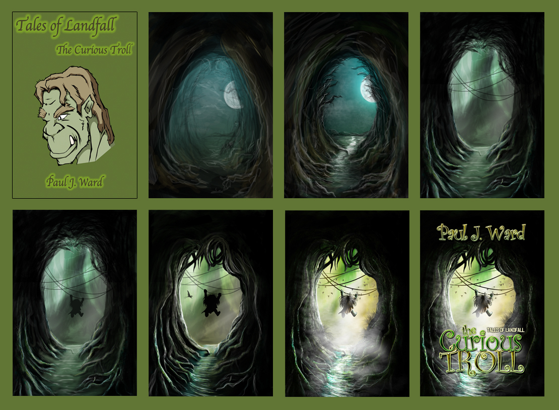
Cover Example
Below is an example of a project I have undertaken called ‘The Curious Troll’ by Paul J. Ward, a children’s story published through Autharium. A quick self-made cover by the author was provided and we communicated at length via e-mail until we got to the final product.
As I said to the author quite honestly, though I have seen worse, the dominant picture used is too simple in context of the background, the font is boring and I felt that it generally would not catch the eye of a prospective reader which in this case is a child and, by proxy, their parents. There is no reference to genre, and as stated above this is key to any cover.
Children’s book covers should hit the eye like a firework because they conventionally rely on colour to captivate young eyes and, by no fault of their own, children do judge books by their cover.
The original picture Paul had used gave the wrong impression of its contents. First of all the illustration is a vector image of a orc, which is not only out of context, it feeds into another story which is perhaps inappropriate for original material. Though hosted within the public domain and labeled as royalty-free, one can overlook the ambiguity of copyright as the website absolves itself of any legal responsibility onto you and it is best to not run this risk.
When it comes to designing or redesigning a cover, it is a good idea to draft out a few concepts out on paper, as a pencil can lead you to ideas that you perhaps never intended. Fortunately for me, for this particular project I had a very strong image in my head of a swamp/forest that forms an arched cathedral-like hallway which is the setting of the story. Initially I focused on the contents of the digital painting with consideration of the layout of the cover, then spent a lot of time adjusting the lighting and vibrancy of the artwork to appeal to the eyes of its intended audience. During the process of creating e-book covers I advise to constantly be aware of the different sizes that the artwork will be subject to by it’s various distributing platforms. Important text should always be large and clear at whatever scale, aligned perfectly central (design permitting) to compensate for the various formatting it maybe subject to.
 Cover designs do take time and this was the case with “The Curious Troll”. Expect hours of experimentation where no ideas come to fruition, expect even more time tweaking and implementing ideas through trial and error. NEVER settle with a cover you are unhappy with. I personally would only affix my name to a cover of a project I am proud of and the thought of associating my name with mediocrity, knowing full well that the cover could be so much better, would be intolerable.
I shall look forward to the e-books that will be released through Autharium this holiday season. For advice or design queries you can contact me at: lukefielding@gmail.com

You must be logged in to post a comment.